

I downloaded the font two weeks ago today because, like so many other people, I saw an article about it shared on social media. I grabbed the font because I thought the idea was funny, and because I’ve been a critic of gerrymandering my entire adult life. I thought, what wasn’t to love about a font that points out the absurdity of gerrymandering? Nothing—if you put aside the fact that it’s not quite that simple or even necessarily very fair.
I discovered that four of the letters—some 15%—were made from Illinois Congressional Districts. I realised how implausible it was that Illinois has among the worst gerrymandered districts, so I looked at them more closely and discovered how misleading those choices—and even the idea that they’re gerrymandered—actually is.
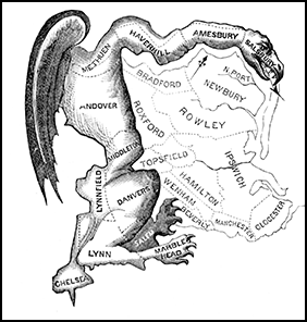 |
| The original "Gerry-Mander". |
The original intent behind the term gerrymander was to describe electoral districts that have been drawn to advantage one party over others, or especially ones drawn to disadvantage the party out of power. That was the case in Gerry’s time, and it continues right up to ours, though now it's also often done to dilute the power of minorities. However, that’s that not the only way that districts get odd boundaries.
Congressional Districts, and most legislative districts within states, are supposed to have roughly equal populations. That’s the starting point. There’s also usually a desire to avoid splitting communities, wherever possible, but the first demand sometimes makes the second impossible to achieve, especially in states with large rural areas and a few small pockets of urban areas, like Illinois has (Chicago, and even the six counties surrounding it, are unlike most of the state in that they’re far more urbanised than most of the state is, geographically speaking). This makes a third goal, making a district relatively geographically compact, very difficult to achieve in real life.
What this means is that even when electoral district boundaries are drawn with no regard for political party, there will still be some odd shapes in order to keep the populations roughly equal; it’s pretty much unavoidable, at least some of the time.
An additional factor in Illinois is that much of the state, aside from Chicago and Cook County and some other urban areas, is pretty Republican—there just aren’t as many people in the rest of the state, with Democrats concentrated in its northeast, and in some Democratic pockets in other parts of the state. Because it’s hard to avoid dissolving Democratic votes into Republican districts, it’s not uncommon for Illinois’ Congressional maps in particular to advantage Republicans in the majority of the state (again, geographically speaking), because the more urban and more Democratic areas outside the Chicago area have to be shared among mostly rural and mostly Republican districts just to keep the populations roughly equal.
This whole process becomes harder after every US Census, because Illinois has been losing one or two Congressional Districts each time. Between 1973 and 1982, the period in which I first became intensely interested in electoral politics, Illinois had 24 Congressional Districts, and it now has only 18.
All of which means that many oddly shaped Illinois districts don’t fit the usual definition of gerrymandering, and that’s probably true for other states, too.
Here’s a look at the four Illinois Districts included in the font (all pictures are from the Ugly Gerry website), listed in Congressional District order:


 Illinois Twelfth Congressional District (the letter “Y”): This one doesn’t have to be rotated. The squiggly line on the left (Western) edge of the district is the Mississippi River. This district is pretty geographically compact, and doesn’t actually look gerrymandered district, especially when viewed in the context of other Illinois Congressional Districts. In fact, the district is a little more competitive than other Downstate districts, in part because it includes urban areas and more heavily Democratic university towns. Most of this district was once part of a district that was represented by US Rep. (later US Senator) Paul Simon, a Democrat, and it’s where the university I attended is located. It now generally has a Republican lean of about 5 points.
This experience has shown me that gerrymandering isn’t the same as drawing oddly shaped districts, even though some people treat it as the same thing. I think we need to be pedantic about what a gerrymandered district actually is because the real thing—trying to advantage one political party over others and to dilute minority representation—is an affront to democracy. In contrast to that, most of Illinois’ “oddly” shaped districts (and probably many in other states, too) are the result of trying to balance conflicting goals in trying to ensure fair representation, and less about trying to advantage one political party over another.
Which means that as fun and funny as this font is, it may not necessarily be fair, and it definitely isn’t a good guide to what gerrymandered districts are (this exercise made me wonder about whether the districts included from other states are actually gerrymandered). Until now, I never really appreciated that there are a lot reasons why district boundaries can be drawn with odd shapes, and it’s not always as “bad” as it may look.
The lesson I take away from this is to always look more deeply into a political argument and try to determine if it’s fair and accurate. This takes a lot of time to do, which is why most of us don’t do it, or don’t do it enough. Even so, it’s important to verify claims made—even when it’s just a novelty font doing it.
Things are seldom as simple as political arguments try to suggest.
Footnotes:
*There's a difference between font and typeface, one that Fast Company described this way: “The difference between a font and a typeface is the same as that between songs and an album. The former makes up the latter. Remember that and you’re good to go.”
**Since these footnotes are being pedantic, gerrmander is properly pronounced like “Gary-mander”, not “Jerry-mander” because Elbridge Gerry pronounced his surname “Gary”. While pronouncing gerrymander incorrectly is common, it’s also adding another layer of insult—but good luck convincing anyone to say it any other way than “jerry-mander” (in fact, I pronounce it incorrectly most o the time). Fun fact: Gerry, who died while serving as Vice President to President James Madison, is buried in Washington, DC, and is the only signer of the Declaration of Independence to be buried in the capital of the nation he helped to form.
2 comments:
Sorry, Arthur - but you'll NEVER win the gerrymander pronunciation fight. https://www.waywordradio.org/pronunciation-of-gerrymander/
Oh, I know! It's one of those things that a friend of mine used to call "fun facts to know and tell"—interesting, but not terribly useful insofar as no one wants to accept it. Heck, even *I* don't usually say it correctly!
Post a Comment